.jpg)


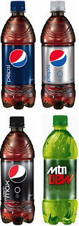
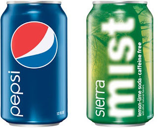
For those of you that haven't noticed there's the new Pepsi logo and typeface. I myself, I'm still unsure of what my opinion of it is. Its a lot more simplistic, perhaps to copy Coca Cola's style that switched not too long ago to a more basic look.
It is perhaps a new style for a new decade. Signalling the end of the eccentric 00's and pathing way for what could be the style for the foreseeable 2010's. From the looks of big companies recent outputs, simplicity is the way forward. Pepsi, Apple etc, all these big world wide companies have gone in favour of this minimalistic approach.
Looking at the new Pepsi logo I think that its an odd change, altering the logo of a big company can always be risky and this one too me looks like it has devalued its brand identity. It look a bit like a cheap brand now or some foreign copy. The change to all lower case seems to try to promote friendliness however it gives off a sense of emptiness and removal of the customer from company.
In my opinion even though it does look perhaps aesthetically better from a graphical point of view, but they may have sacrificed this for a familiarity that customers love and form with brands.


I think that the lower case type actually works quite well however, I do think that they should have left the logo as it was. It now looks too simplistic and, as you said, does look a bit like a cheap knock off that you get abroad.
ReplyDeletePepsi has changed its logo so many times over the years. if you look up its first logo, it tries to copy identity of Coca Cola. It has then adapted this 'circle' logo frequently over the years. Why? I am not quite sure.
ReplyDeleteWhen you consider the Coca Cola logo you could say that it is quite old fashioned due to the choice of typography used, however it has stood the test of time. Could it be that Pepsi feels it has to reinvent their logo in order to maintain sales?
The majority of their advertising campaigns over the years have employed celebrity faces to help increase sales, whilst Coca Cola uses a polar bear.
I quite like the simplicity of this new design, but I don't think it will be that long until it changes again.