About Me

My photo
Dundee / Ayr, United Kingdom
Graphic Design, Photography, Design, Freelance. 3rd Year Graphic Design, Duncan of Jordanstone College Of Art and Design

Thursday 29 October 2009

Font Yukle


I found this handy website today that offers thousands of good quality free fonts, definitely worth a look. Enjoy.

Wednesday 28 October 2009

Objectified


On Tuesday night I went along to to the DCA's screening of Objectified. Billed as Helvetica the sequel, Objectified is the follow up film by Gary Hustwit in his design trilogy.

I must say that I enjoyed this documentary and appreciated the way it looked at how designers design the seemingly unimportant things that we may dismiss as design. Their example being at one point garden shearers. I myself would have simply dismissed these objects as the subject of design through the idea that they arent glamourous or impressive to look at in any way but are simply a functionaly device for a seemingly unimportant task. But then again who else would create these things if it wasn't a designer. I probably had the same mind set as a lot of people in thinking that certain things were just made and did not consider design at all. However when you look around every single thing that you see has been designed in one way or another, may it have the complexity of a laptop or the simpleness of a tooth pick, likewise at one point someone has had to have made a decision on the aesthetics, ergonomics etc. and not just simply start producing.

We as designers have such a huge responsibility these days to produce objects that do not simply serve their purpose but have multiple functions, shelf lives, safe environmental properties, all that have such a large baring on the success of the product. Designers of the past perhaps didn't have these worries but this is the future of design now and is something that isn't going to change. One of the points that was brought up in Objectified that particularly struck a chord with me was made by Karim Rashid, he was talking about the life of products and that if their only intended to last for, say, 11 months then why are they built to last forever. This got me thinking surely there must be a way to make either design last or make it degradable. The latter seems to be the more plausible as people are simply too interested in new things. Everyone wants the newest laptop or phone or iPod whereas we could easily still be using the same one from 3 years ago perfectly well. The wants of the people are not going to change so it is us that will have to instigate a change perhaps starting small and working our way up.

The film raises a great number of discussion points and to me goes a lot deeper than the previous film on Helvetica. The discussion on multifunctional design, I thought was the most interesting and thought provoking area of the film and is definitely something that I feel in the near future will definitely be the main factor in not only my work in design but all designers work.

Wednesday 21 October 2009

Colour Blind and Design

In the first lecture of this semester with Jonathan Baldwin he posed the question of was any body in the group colour blind and I was surprised to find that I was the only one who raised their hand. Unless some people just didn't raise their hand this means that I am the only person in second year design that is colour blind. 5-8% of males have some form of colour blindness which means that out of a lecture of perhaps 200 people there should be at least around 10 people including me.

After that lecture it got me thinking about being colour blind and how much it actually affected me as a designer or and artist, and it made me wander if people who were colour blind would avoid going into a discipline that relied so heavily on colour.

At that point I was currently awaiting a response from the disability services after sending them an enquiry as I was having some difficulty working on the Macs in the computer suits. I went in for a meeting with an adviser later and was quite shocked at her lack of knowledge and somewhat patronising approach to the subject. I didn't feel that she understood colour blindness (although stating her husband was so she knew all about it) and also why it could pose such a difficulty in a design based subject. This lead me to think that if she didn't really understand it then most other people wouldn't either so I tried my best to think of way to describe it so that people would understand.

So I'l try my best to describe it in a way that everyone will understand. Basically the term Colour Blind is a bad term for it, we aren't blind in any way, we can see in the exactly same way as you do. However it is all about perception and how or what you perceive a colour to be. I read a good story by a colour blind Canadian man that best descrtibes it...
One day this man went out and bought 4 blue mugs, and for years he had his favourite blue mug. He didn't have a reason but 1 of the 4 was his favourite, and one day he couldn't find it so he asked his wife where his favourite blue mug was. Blue mug.....she said? Your favourite Green mug is in the bedroom. He was unaware that years ago he went out and bought 3 blue and 1 green mug and as they were all together he assumed they were all blue. Although as soon as his wife told him that one was blue and one was green he could see a clear difference.....This in my case is what colour blindness is to me, all that's needed is a little help. It's not what colours this pen? Blue. Aww well you can't be colour blind cos if you were then you would think it was yellow.

Some good did come out of my meeting with the disability officer however as she sent for a man from the ICS department to come see me about software that could help. He was a very nice man probably in his late 50s and he took a keen interest about finding out about Graphic Design. I was also pleased to find out that he was also colour blind and in his younger years had wanted to peruse a career in art and design. The sad part was that he felt that because he was colour blind he wouldn't be able to do something like that. This brought me back round to the thought that other people were still thinking this way when it is quite easy to get round these obstacles now. I personally don't feel at a disadvantage and don't think that I should either as to be honest it's quite nice to be different some times even if its just through my eyes.

George gave me a few websites to look at to help. There are a few that are particularly useful and should be looked at not just by colour blind people but by others too as they are useful to help them understand. Enjoy.

http://www.colblindor.com/ - this ones very useful


http://www.colorschemer.com/download.php - theres a download called colorpix which is quite good.


Wednesday 14 October 2009

Jamster


Like me I'm sure many of you have been irritated greatly over the past few years by the painfully annoying revelation that has been television ring tone adverts by the likes of Jamster. However I don't see how these companies can continue to operate with the amount of relentless advertising that they do as god knows who buys their products? With tariffs like "join now for only £4.50 per week" for this luxury screen saver, I don't imagine many people see that and think what a great investment.

Jamster did have great success a few years ago with the crazy frog phenomenon that some how managed to spawned not 1, not 2 but 3 albums! But I just don't see where a constant string of customers is still coming from since then that would lead them to believe that selling ring tones, wallpapers etc. will still make money. Young children is the likely target market although I doubt any parent in their right mind would fund anything this ridiculously obscene. Or maybe there is a group of 40 somethings that huddle around the water cooler and compare Love-O-Meters and Speed Gage wallpapers.

I imagine that their repetitive pointless adverts would put off potential customers rather than endear them to the company but who knows.

That's just my completely unbiased opinion...

Monday 12 October 2009

Polystyrene + Gherkin = ?


So another brief arrived on my desk today, this time we're to combine the research we did on our material (polystyrene) and food (gherkin) to make a futuristic product and packaging for it...

Think i might need to work on my ideas a bit.

So far I've got a polystyrene gherkin...

The Tipping Point

So, mind mapping. What does it really mean? Words in bubbles pointing to other little bubbles, which in turn take you to other little bubbles until the page is filled with untraceable scribblings of (you guessed it) little bubbles.

No. Not quite. I always assumed that mind maps and spider diagrams were the same thing, and to be honest I didn't like them. They don't work for me and never have done, so when I found out we had to complete a task using mind maps I was just thrilled as you can imagine.

However, I was pleasantly surprised. We were asked to map out The Tipping Point by Malcolm Gladwell, using the method taught by Tony Buzan in The Mind Map Book. We were to give a brief description of each chapter and then to go into greater detail on a specific chapter.

When doing the overview in Buzan's style I found that it was in fact a simple way to remember facts. The method is to use different colours for each different branch, in this case this was each chapter, and also use varied text or sketches to help you if you want. The mind map method is very free and flowing and unregimented unlike standard bullet pointed note taking. Using this method you can quickly and easily find and jump to the piece of information needed.
For the next part of the task we had to map out an individual chapter, mine being The Law of the Few: Connectors, Mavens and Salesmen. I felt this particular chapter was interesting and had a wide depth of information which explained a lot about the spread of epidemics and how they are down to a select number of people.

Although I was pretty sceptical at the start about the whole process of mind mapping, I do however now see the benefits of this process and hopefully will be able to put them into practice again. There was one down point however. Using different pens for me means making lots of mistakes and poorly trying to hide them, so if you look close enough you will realise that I am a boy badly in need of tipex.

Tuesday 6 October 2009

Flickr


So I thought that I would get all into designer mode and start connecting with the world a bit more. My first step was to join the shiny world of flickr and start sharing and my brilliant pictures with everyone, so made the account. Then realised that I don't actually have any.

Next stop the camera shop.

Gherkin?


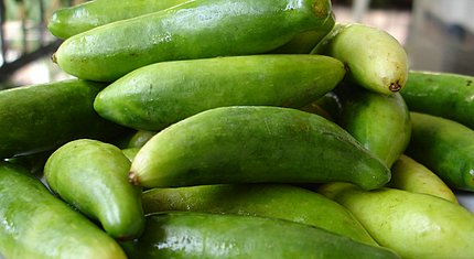
So.... gherkins. Is there anything nice you can say about them?

Probably not. But once again I have felt the wrath of the lucky dip. For this brief I have to research and compile a sketchbook to do with these scrumptious little ugly things, that nobody that I have met so far likes. Except from my girlfriend.....of course.

Much like the last brief that we were set, which was on materials, which
I drew polystyrene (oh yes the gherkin of the material world) I was grasping at straws for information. That was until the Gherkin building came to mind. Designed by Lord Foster, I've never really appreciated what an amazing building it actually is. Admittedly architecture seems to pass me by at times but after looking into Foster+Partners and at their website www.fosterandpartners.com I began to appreciate how wide their area of design is.

So I managed to find something good to say about gherkins, just don't try and make me eat one!