About Me

My photo
Dundee / Ayr, United Kingdom
Graphic Design, Photography, Design, Freelance. 3rd Year Graphic Design, Duncan of Jordanstone College Of Art and Design

Thursday, 4 March 2010

Assignment 3 The Bingo Blend


For Assignment 3 as our task was to people watch we chose as a group to take a visit to the bingo to learn their "rules" and observe how individuals behave here when put under scrutiny.

I will start this off by firstly stating that try as we might we did not blend into the regular bingo crowd. Through no fault of our own I may add, just simply because the majority of them had a good 50 years of "experience" on us. We will bypass this fact for now though.

We went on a Wednesday night, i'm not particularly sure but this may not be a very important night on the bingo calendar so this factor may have to be taken into account when you look at the findings. I would imagine that if we perhaps we had went on a Friday or Saturday then the atmosphere and cliental could vary. On entry to the foyer I was quite surprised by the decor as I always just assumed that it would be quite dim and dingy for sum reason. It was however very fancy and quite smartly decorated. We weren't particularly sure of what to do at this time as i didn't initially know that you had to become a member before playing. The staff however seemed used to the look of blank faces and asked if we would like to join. In this area of exploration peer help was quite necessary as although the staff were willing to help they didn't really give you any indication of what to do. After signing up and being handed a welcome pack (that didn't have any instructions on how to play the game) I found myself stranded alone at the pay desk, completely unaware of what I was going into. There were a list of games on a board telling us what we could buy however the woman on the desk was just trying, hard as she might to get me to buy the most expensive package. I eventually settled on the 80p tight fisted option.

From my initial encounter with the reception area I found the experience to be quite confusing, the staff, although helpful to an extent, were more willing to get the regular clients through before us. From this it seems as that this is quite a regular occurrence for a lot of people as the staff could easily tell the newbies from the old hands.

Before entering the main bingo hall we had to pass through an intense blast lof flashing lights coming of an array of slot machines, this room gave off a vibe similar to a casino, entirely different to the rest of the bingo hall. We entered a vast room that was around semi filled. We were not too sure were to sit as the etiquette of the place was by no means obvious from first glance. We opted for a seat nearer the back to avoid any horrendous faux pas.

The actual game of bingo itself I found not too bad and quite simple to understand, although all of us had a slight variation on what we thought was going on so this combination could have hindered some peoples taking to the rules of the game initially. I had a slight knowledge for the game from playing semi-serious versions of the game on holiday although some of the terminology used threw me a bit. There were occasions when people in the group shouted "HOUSE" when we in fact didn't have it as we tried to grasp the rules of the game unsecessfully. The people there responded quite well to this though and were quite friendly and helpful about it.

Onto the subject of analysing of the people there. I found that I had to take notes when I was there as there was so much to take in, I managed to disguise this and not be too obvious by taking them on my phone.

The general age of the people there was roughly in the late 40s to 80s category, them predominately being women, although there were quite a lot more men than I had anticipated. For men it seemed that the majority of them were there accompanying there wives rather than with other men however some were alone. There seemed to be quite a few mothers and daughters and groups of no more than 3 women together. As much as this seemed in the outside to be a fun group activity, from what I saw people preferred to do the opposite from this. From the look of it the majority of the people there were likely to be either retired and if not probably working class. There seemed to be very little communication between groups with relatively no conversation being audible unless it was to display displeasure after someone winning. I noticed that a trend seemed to have emerged with groups of people sitting near other groups and people on their own, sitting near others who were doing the same. I would have thought that this would have been quite a good place for older people to meet and chat between games but apparently this wasn't the case.

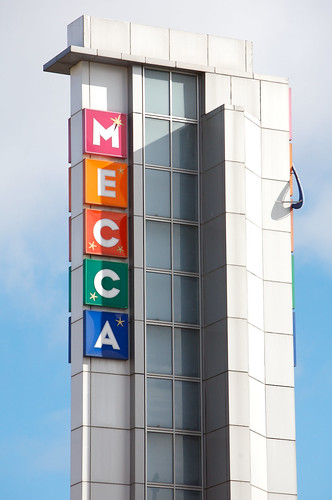
The halls appearance when looked closely enough at actually mirrored the outfits of the bingo goers. As the tones of the walles were very close to their clothing with a mixtures of creams, light browns etc. I wondered at the time if this had been done intentionally to make them feel more safe or relaxed as it did seem like quite a big contrast from the advertised Mecca Bingo company colours of bright blues, reds, greens and yellows. I noticed from the advertisements dotted around the place that they advertised lots of younger aged women than the ones that were actually there, this may be to try and get the next generation interested to guarantee future business. These advertisements were heavily aimed at women or even single women as even in the mens toilets there was a picture of a lone young woman having fun at the bingo. This could be interpreted in a number of ways, my initial reaction was that they were aiming it solely at women as no men were on the featured posters. However as they were in the mens toilet I was wondering if they were trying to advertise the fact to men that there were lots of single women that went to the bingo and that it would be the ideal place to meat a partner?

When it came to knowing how to play the game I felt that this was what made the place seem its most private and cliquy. There was no attempt to explain anything, either verbally or through wall images or table cards. I felt that I a perhaps a bit of an intruder in this sense as if you weren't in the know they you would flounder for the first half of the night. I don't know if Mecca are trying to keep the same type of customers or not as if you were not taught by someone who went to the bingo the you would be lost as we were for a while. There were some things such as handsignals to the roaming hall staff that I didn't really understand, which makes me think that this is quite a got-to-know type of place that has its regulars. The use of bingo language was quite difficult to grasp especially when having to concentrate hard on the game as well. For regulars this didn't seem to be an issue though as some were having tea at the same time, playing two cards and one woman was even reading a magazine. this probably showed our inexperience at our lack of skill.

Thats A Bingo!

This task was perhaps one of the most interesting and enjoyable that we have done, as I enjoyed being thrust into somewhere new as I gained an experience out of it. The task wasn't even conscious as the majority of the work was done on reflection.

Thursday, 25 February 2010

Is that Pepsi?


For those of you that haven't noticed there's the new Pepsi logo and typeface. I myself, I'm still unsure of what my opinion of it is. Its a lot more simplistic, perhaps to copy Coca Cola's style that switched not too long ago to a more basic look.

It is perhaps a new style for a new decade. Signalling the end of the eccentric 00's and pathing way for what could be the style for the foreseeable 2010's. From the looks of big companies recent outputs, simplicity is the way forward. Pepsi, Apple etc, all these big world wide companies have gone in favour of this minimalistic approach.

Looking at the new Pepsi logo I think that its an odd change, altering the logo of a big company can always be risky and this one too me looks like it has devalued its brand identity. It look a bit like a cheap brand now or some foreign copy. The change to all lower case seems to try to promote friendliness however it gives off a sense of emptiness and removal of the customer from company.

In my opinion even though it does look perhaps aesthetically better from a graphical point of view, but they may have sacrificed this for a familiarity that customers love and form with brands.

Monday, 22 February 2010

Activity 2E The E.N.D

For the final stage of Activity 2 I added a word to my 4 images to furthermore enhance the message or story it was trying to communicate. I was in fact pleasantly surprised. I am starting to, or at least think I am beginning to see what Barthes was talking about.

I added the word REWARD to my images, I still didn't get a full return on the stories but the majority of them were along the same lines of someone catching cattle to be transported and being rewarded with a glass of milk. I found that if they were rearranged with the glass and the word coming last that this was the way to get the best results.

I believe to a certain extent that this was what was asked of us in the task, however as much as I enjoyed the physical task, I found the whole idea of the Barthes essay baffling. I didn't understand it properly in all honesty on a number of points, even after extensive discussion within my seminar group, although this did shed a bit of light onto it. I feel that the exercise would be on the whole better without Roland Barthes' influence as I feel it slowed the whole process (that I'd imagine would have the same outcome without it) down.

In relation to the picture activity however I do see this as a helpful task especially in Graphic Design, when understanding text and image, as it is a very important part of the subject. The whole idea is that an image has to communicate its message in the most powerful, effective means in a short space of time. When we discussed as a group, Sophie brought up the Diet-Irn Bru adverts where you are to spot the difference in them. We proceeded to have quite a lengthy discussion to what we all felt this advert was meaning. As an advert I think in terms of this task it would have failed as it wasn't immediately clear what the message was. This perhaps enhances the need for strong text and imagery.

Sunday, 21 February 2010

Adding Another Picture Activity 2D


For this task as I mentioned before, we were to add another image to try and get the same answer from all people that we asked. I picked the answer that I received from Connor. I added an image of a glass of milk to try get the answer of of captured cows being transported and being rewarded with a glass of milk or better milk. Something along those lines.

These are the three closest matched ones.

There has been a new type of milk found in India that helps cure diseases. It was found in a heard of cows who were captured and are currently in captivity. There have been plans to fly them back to the UK to do further tests on this new wonder milk.

Mhairi 19, Student Primary Teacher

A cattle herd escaped from a farm in the Australian outback. In order to find the herd a cowboy was flown over from U.S.A. The renowned cowboy used his skills of tracking and ropes to catch the stray cattle. Upon the safe return of the herd the cowboy treated himself to a glass of fresh milk.

Brian 20, Student Medic

In the summer I went on a plane to mexico to work on a cattle ranch. The cows were very difficult to catch so i had to tie them up with rope and managed to farm them for there milk. In the end it payed off as i was rewarded with a nice glass of milk from the cows.

Rowan 17, Student

From the outcome of this exercise I can see perhaps a bit more how images can have such a strong effect on viewers. I didn't however get the same answer from all the people I talked too, and the next exercise will probably help me to get a better, more specified result. See you at the E...

Saturday, 20 February 2010

The 3 Picture Experiment (Activity 2B+C)

For Activity 2B+C we were to put 3 random images together and asked to gather stories from people to see what they thought linked them together. Here are the 3 pictures...
And here are some of the initial responses...

It is another hot day in a far away foreign country and it is already humid and boiling hot for the ground staff of the airport who have got . The rope is being used to pull the cows into the crate they are being transported, in as part of aid relief in Sub-Saharan Africa. They are going into the holding compartment of the passenger plane set to take off later in the day. The cows are dreading it because they know as soon as they arrive in Africa there due for the feast and they are not good flyers.

Ewan 19, Geography Student

A herd of cattle ( or is that goats ?) getting rounded up by being lasooed ( not sure if thats how u spell it) slaughtered & there meat shipped abroad

Helen 47, NHS Worker

The rope is used in a lasso type roll to tie round the cows necks to act like a lead. These are then used like a lead on a dog to pull the cows onto the plane - I envision a Noah's ark type of scenario....

Donna 22, Events Manager

BREAKING NEWS...

Today it has been confirmed that the reasoning behind the Hudson plane accident was not that of birds in the engine but three texan passengers had actually each tried to ship their "prize bulls" which they had won in an American lasso competition. With the increased weight in the hold the aeroplane finally succumbed to the pressure in the hold as the plane made its way over New york making the plane plummet to the ground landing in the icy water of the hudson river. All cowboys have now be warned that lassos and cows should not be placed in the hold as a manner of shipping.

It is a lesson to be learned by aeroplane charters across the american nation.

Kayleigh 21, Fashion Student

A small herd of cattle have been tied together and somehow attached to an aeroplane with rope so they can try and pull it. don't know why or who has done it but the world is a strange place!!

Mark 21, Business Student

As a plane was taking off from the runway a long piece of rope got caught on the wheel, the end of the rope were tied round the hooves of four cows, and it flew away with them, it was all part of a joke.

Nick 21, Graphic Design Student

Due to new research done by scientists, farmers have begun to throw cows out of aeroplanes and kept in the air by ropes, it is said to improve the taste and creaminess of their milk.

Connor 20, Graphic Design Student

An elderly farmer had the chance of a lifetime - to see his daughter, who now lives in Australia. It has been 10 years. His daughter came into a small sum of money recently and her first purchase was a plane ticket for her father. He would move there in a heartbeat but he couldn't bare to part with his cattle.

Brogan 21, Sales Assistant

I received quite a variety of stories. At the moment I am still quite unsure of what the meaning of polysemy that was talked about by Barthes is. I think that this may become more clear when I add another picture for Activity D or text in Activity E as try to get the stories to match. Till next time...

Wednesday, 17 February 2010

Roland (Bags of Fun) Barthes


For assignment 2A we were to read Roland Barthes' "Rhetoric of the Image". I'm not going to lie, but on first glance it was probably the hardest, most boring thing I have ever read. Not due to the physical content but more so because of the ridiculously over complicated language used.

Eventually I simply had to find a summary of the text http://mh.cla.umn.edu/ebibld4.html. On reading this thing started to become a bit clearer as the 3 main points of the linguistic message, coded image and non-coded image started to gain some meaning. Here is, as I currently understand it, what Barthes is trying too put across.

When looking at an image there are 3 things that me must pay attention too, if we are to understand the image correctly:

The Linguistic Message - this is the text in the image and how it relates to the feel of the image. In the example given the text on the pasta put across the companies name and the fact that it was meant to be Italian from its appearance.

The Coded Iconic Message - These are the things that we assume from the image (its like reading a code!), such as if there's some some bright attractive fruit or veg then we assume that its ripe even though it doesn't explicitly say "this tomato is ripe". They wouldn't write this as it would imply that they were from it appearance.

The Non Coded Iconic Message - This is simply what you see, if there's a bag of pasta there, then there's a bag of pasta there. Simply there is no code, you don't have to read into the image.

This has lots implication for Graphic Design as the main essence of the subject is text and imagery. Images are defined through the eye of the beholder, and if an image isn't presented correctly then a completely different message could be conveyed. The use of typography can be key to the placing of certain products in certain categories e.g. pasta in an Italian style font. If this was presented using say a font from a western then it could mean something completely different than Italian pasta.

This is currently what I think that this extract means however I will return after task 2B+C and I will have re read the passage to see how it implicates Graphic Design, that is if I haven't blown my brains out from the over use of unnecessary language.....just kidding.....but maybe not.

Monday, 15 February 2010

Monkeys Typing Shakespeare


A friend of mine recently recommended the documentary To Infinity And Beyond to me, currently available on BBC iPlayer. The documentory is on the concept of infinity. How its used in maths, science and all around us.

A word of warning, its not for the weak minded, currently my heads set to explode, probably just after I finish writing fvns fvugerhklr ;hnnmbhtnlr.tkjh.... just joking.

There is one concept that particularly interested me. Its the notion of the Monkeys typing Shakespeare concept. I probably won't do it justice by trying to explain how it works so you would probably be best looking it up if you're interested http://en.wikipedia.org/wiki/Infinite_monkey_theorem. The idea is that if a monkey were to hit the keys of a type-writer an infinite amount of times, then it would surely eventually write out the entire works of Shakespeare, as well as every book ever written. It is a concept that I struggle to get my head around but it does make sense.

I recommend that you give it a watch even if you do skip some bits.

Oh and ignore the bald guy, he's a pain in the arse.