About Me

My photo
Dundee / Ayr, United Kingdom
Graphic Design, Photography, Design, Freelance. 3rd Year Graphic Design, Duncan of Jordanstone College Of Art and Design

Monday, 15 February 2010

Thursday, 11 February 2010

The Big Panic


A lot of people in our class have been feeling a bit overwhelmed by the workload that has been presented to us at the moment. Although I do feel like there has been a lot given to us in a short space of time, I believe that the outcome of the next 3 weeks with be a good test of our resolve and also a good piece of character building.

At the moment my personal life may be taking a bit of a back seat due to the late hours in college but by the end of this period I think that we will be stood in better stead for 3rd year, 4th year and the eventual bridge into industry. As when we do no one will care about our personal lives or if we have other projects as people simply want things on time and with no hassle.

In my view its just a way of showing our ability to work under pressure, organise out time management and also show that we can produce the goods no matter what deadline.

I'm sure that when it comes to the day before the 3D Typography exhibition (opens 26th Feb) that I will begin to panic. However for the time being I think that I am just going to knuckle down and try to do the best that I can with the time that we have been allocated.

Wednesday, 10 February 2010


Thats all really. Just saying.

Sunday, 7 February 2010

Quis Custodiet Ipsos Custodes?


I finally completed reading the Watchmen by Alan Moore and David Gibson last week after getting it as a birthday present (September). I subsequently went on to watch the film, as I've have been putting it off since getting it for Christmas preferring to finish the book first.

After you get past the obvious fiction of masked heroes, the book deals with some quite current issues although being written over 20 years ago. It tells of impending war with middle eastern countries (albeit between Russia), the threat of nuclear war and the public's unrest with their government.

The day after watching the film I was at the car park around the back of my flat and I noticed some newly scrawled graffiti along one of the walls. Someone had sprayed "Governments should be afraid of their people" in black paint with an acid house smiley face. I was still in my watchmen state of mind on seeing this so I was waiting at home for the news of mass riots and nuclear warfare breaking out. However it was probably just someone trying to direct a political message to an area that generally doesn't care. I wasn't too sure what the person behind the graffiti was trying to get at, I just found it quite surreal on seeing it as the tag-line of the film "Who Watches The Watchmen" came to mind...

Picture Time - Assignment 1

For this assignment we were set the task of swapping photos with another student who we werent familiar with, in aim towards practising primary research for the upcoming semester. I swapped photos with Kirsty from textiles, we were too look at each others pictures and try and find out what kind of person each other was, what kind of tastes, childhood and families we had.

Kirsty gave me a mixture of pictures, below is the feed back that I gave to her...

You look like you had quite a family orientated childhood and were surrounded by lots of aunties uncles and cousins. You perhaps have a twin brother or one close in age. Either that or you were an only child.

You are alone in most of the pictures, that suggests that although you may have had friends you are very comfortable spending time in your own company. This could be because you lived some distance away from them as seem to be from the country from the looks of the photos. The house that your climbing the fence of suggests that you may have lived on a farm or had family that did. You may have moved house at a young age but continued to live in the countryside in a large house.

From a young age your clothes suggest that you spent a lot of time outdoors and were perhaps not particularly vain in any way or may have been a bit tomboyish growing up? You also seem to be an outdoors person as only one of your pictures is from inside. To me this looks like you are quite adventurous and eager to try new things, and that this started from a young age. You don’t look as if you were ever spoiled when growing up and was always kept quite level headed. Personal possessions don’t seem to feature much as they may not be of particular importance to you which suggest that you may value other things higher than them.

As you grew older it looks like you formed a group of friends but although you fitted in you may have stood out from the crowd as a bit of an individual. Whereas most of your friends clothes are quite similar you look like you developed your own fashion sense perhaps to stand out and be different from others and the norm. You appear to be a bit more girly as you grow older as your hair and jewellery suggests. You like bright bold colours this suggests that you are quite a confident, positive person, also as you are smiling in a lot of the pictures. Your holding a glass of wine in one picture which looks like you like to have a good time...

From what Kirsty has said I was quite close with my description with only a few things being wrong, like her living on a farm and that she has also got an older sister. I found that it was a little bit difficult to describe what she is like now as most of her pictures are from quite a young age.

From the feed back that I received from Kirsty I believe that she may have got quite a good grasp of my personality but may have been a bit unsure of some areas of my personality, this could be due to the lack of pictures of me at an older age which was the same problem that I had.

I enjoyed this assignment as it was a new experience, although it was a bit unnerving at times as I felt that I was being too critical of someone who I don't even know. After this though I feel as though I am a lot more prepared to undertake the primary research required for the rest of this semester.
Thursday, 4 February 2010

Ikea Scandal?


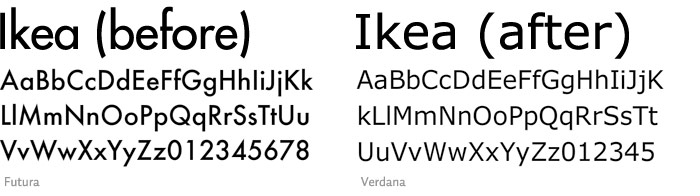
I stumbled across a piece of interesting information today, while pursuing my research for a project on visual languages. The term "interesting" would only really applies to a very small number of people, and I'm not particularly sure if I am interested. An apparent outrage has broken out on the internet over the change of the Ikea typeface for the 2010 catalogue. The switch from the iconic Ikea Sands to the free Microsoft typeface Veranda has Ikea fans crying out in rage for it to be changed back.

Now there are a few things wrong with this story. Firstly being the fact that there are actually Ikea "fans". The idea that there are a group of people who are dedicated DIY store fanatics sort of makes their opinion worthless if you ask me. Although from a typographic point of view i can kind of see their view although I would never be bothered. If it was something personal like say a band I was fan of changed their logo I would perhaps be a tad bothered. But not Ikea!

For this project i'm to tell the story of Frankenstein through the use of a visual language. I have decided to tell it through the medium of an Ikea manuel for building a clock. The idea is that if the clock is put it together then it will work perfectly, however if something goes wrong you can create a monster. I am currently going through the process of building a backwards moving clock for the monster, however my clock making skills still have a lot to be desired.

Tuesday, 2 February 2010

Futuristic Strawberries


This post may possibly relates to the last post in some sense. Today I was drawing up plans for an A2 broadsheet that i'm producing on strawberries. I have been researching them in some length for the last couple of week and have found out some pretty useful information. My main focus will be on white strawberries.

I am quite aware that a lot of people will not have come into contact with these, and I feel that I would be right in saying that most people would not ever choose to eat what looks like an unripened strawberry over the normal red ones that are so popular. It can be quite common for people to be allergic to strawberries however unlike the red, the white strawberry lacks the Fra a1 protein that causes these allergies. My spin will be on would people still be as attracted to strawberry should they lose their red colour for a more allergy friendly white or are we drawn to the aesthetic qualities of our food such as the romantic red heart shape?

While planning the layout for this piece I came up with the image of a red strawberry looking at a white reflection in the mirror. I contemplated drawing this image but instead went to the computer lab and within 10 minutes had a finished piece. This got me thinking about the speed of the modern industry and, like I said in the last blog, that we are now in the golden age where everything is at our finger tips. Nothing is ever more than 10 minutes away from idea to hard copy. From my view as a Graphic Designer this is a dream come true as it means that we are never unable to put our point across and now in a way that people can instantly see.