
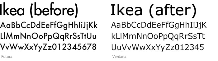
I stumbled across a piece of interesting information today, while pursuing my research for a project on visual languages. The term "interesting" would only really applies to a very small number of people, and I'm not particularly sure if I am interested. An apparent outrage has broken out on the internet over the change of the Ikea typeface for the 2010 catalogue. The switch from the iconic Ikea Sands to the free Microsoft typeface Veranda has Ikea fans crying out in rage for it to be changed back.
Now there are a few things wrong with this story. Firstly being the fact that there are actually Ikea "fans". The idea that there are a group of people who are dedicated DIY store fanatics sort of makes their opinion worthless if you ask me. Although from a typographic point of view i can kind of see their view although I would never be bothered. If it was something personal like say a band I was fan of changed their logo I would perhaps be a tad bothered. But not Ikea!
For this project i'm to tell the story of Frankenstein through the use of a visual language. I have decided to tell it through the medium of an Ikea manuel for building a clock. The idea is that if the clock is put it together then it will work perfectly, however if something goes wrong you can create a monster. I am currently going through the process of building a backwards moving clock for the monster, however my clock making skills still have a lot to be desired.
Lol, your story put a wee smile on my face tonight. However I do prefer the original logo, but am sure by the end of the year people won't even notice the difference!
ReplyDeleteHaha, this made me laugh too.
ReplyDeleteI prefer the first one aswel, but not that much that I'll lose sleep now I've found out it's changed.